Rate of Change of a Function Represented Graphically
The rate of change of a function represented graphically allows us to determine in a much more intuitive way whether it is a constant (fixed) or inconstant (not fixed) rate, and also if it is a faster (steeper slope) or slower (more moderate slope) rate.
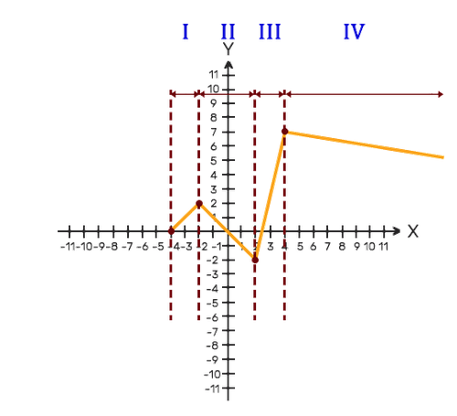
The following graph can demonstrate the aforementioned in the best way:
Rate of Change of a Function Represented Graphically

Let's observe the graph. We will notice that it is divided into 4 different branches. Now we will analyze each of the branches:
- Branch 1: the graph rises (increasing function) at a constant rate (straight line).
- Branch 2: The graph falls (decreasing function) at a constant rate (straight line).
- Branch 3: the graph rises (increasing function) at a constant rate (straight line) and more quickly than branch 1 (the slope is steeper).
- Branch 4: The graph falls (decreasing function) at a constant rate (straight line) and more slowly than branch 2 (the slope is more moderate).