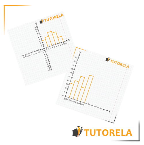
We regularly encounter discrete graphs in everyday life, whether in newspapers, books, articles, therefore it is very important to understand what information is behind these graphs.
Discrete graph
What is a discrete graph?
A discrete graph is actually a bar chart that shows separate categories along the horizontal axis, when there is no sequence between the different values.
- The values are actually not numbers, but quality (non-numeric) categories.

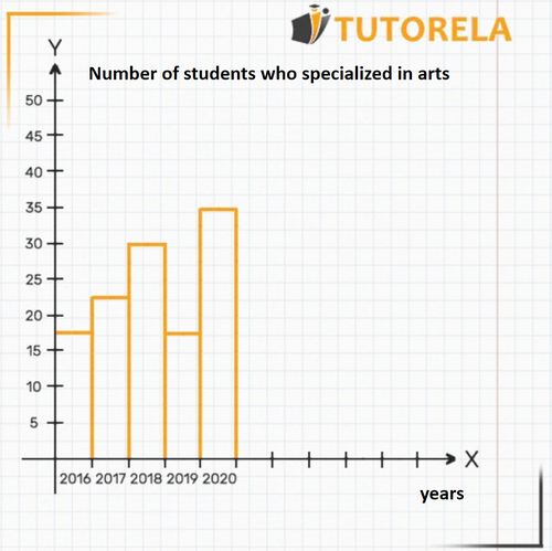
Below is an example of a discrete graph.

In this graph, the years are placed on the axis, while on the axis are the number of students who specialized in arts at a particular school.
- Each column is separate and does not form a sequence of columns before or after it.
- Through this bar diagram, it is possible to get an impression of the changes that have taken place over the years in the number of students in the arts branch, but there is no numerical sequence between these values.
If you are interested in more information about "graphs" you can find detailed information in the following articles:
Data Collection and Organization - Statistical Research
Reading Information from Graphs
Graphical Representation of a Function
In the blog of Tutorela you will find a variety of articles with interesting explanations about mathematics
Sometimes graphs may seem complicated, but if we understand how they work, we will see that they are actually very simple. A graph is just a way to show a lot of information at once.
We have several basic types of graphs. In this article, we will learn about discrete graphs. To understand how they work, we will start with an example. In the example shown below, you can see a graph that represents the number of students who took Art in each academic year.

Every graph is composed of two axes: the axis and the axis. The axis is the horizontal one (we can imagine it as the floor of the graph). In this graph, it indicates the years, as explicitly stated. The axis is the vertical one (we can imagine it as the wall of the graph). In this graph, it indicates the number of students studying art, as written next to it, in the title: etc. up to .
In this article, we will learn to analyze the graph of the function.

Every graph is composed of two axes: the axis and the axis. The axis is the horizontal one (we can imagine it as the floor of the graph). In a discrete graph like ours, the axis will represent different categories. Let's look at the example we have. Try to identify the axis, it is marked with that letter.
In this case, the axis indicates the category Years, as described, to its right, in the title. We can see the years written on the graph below each column: and so on.
The axis is the vertical one (we can imagine it as the wall of the graph). In this graph, it indicates the number of students studying art, as written next to it, in the title: etc. up to .
Through this graph, we will interpret how many students studied Art each year. This information is represented in the columns.
For example, let's look at the axis in the year . We see that over the year there is an orange column that rises up to the number on the axis. This means that in the year exactly students studied Art.
Another example, let's look at the axis in the year . The column over rises exactly to the number 35 on the axis. That is, in the year exactly students studied Art.
Now, try it yourself, let's see if you can find out how many students took Art in the year . Identify the requested year on the axis. Now you will notice that the column rising from the year does not reach a clearly marked point on the axis. However, we can see that the graph reaches approximately a midpoint between and . So, it is probably about or students (since it cannot be students, it would be impossible to think of half a student).
Although the exact answer is not entirely clear, it is enough for us. Knowing that it is about or students is sufficient. This is the information we can deduce from this graph as it is. If the graph of the function were more detailed, we could deduce exactly how many students studied Art in the year .
The reason for the name used for this type of graph "discrete graph" is because each category acts "at its own discretion" and without relation to the others. There is no continuity between the categories, each column is independent and unrelated to the adjacent ones. Next, we will see a graph of another type, a continuous graph.
- Inequalities
- Inequalities with Absolute Value
- Coordinate System
- Ordered pair
- Graphs
- Reading Graphs
- Value Table
- Continuous Graph
- Absolute Value Inequalities
- Numerical Value
- Function
- Linear Function
- Graphs of Direct Proportionality Functions
- Slope in the Function y=mx
- The Linear Function y=mx+b
- Finding a Linear Equation
- Positive and Negativity of a Linear Function
- Representation of Phenomena Using Linear Functions


